
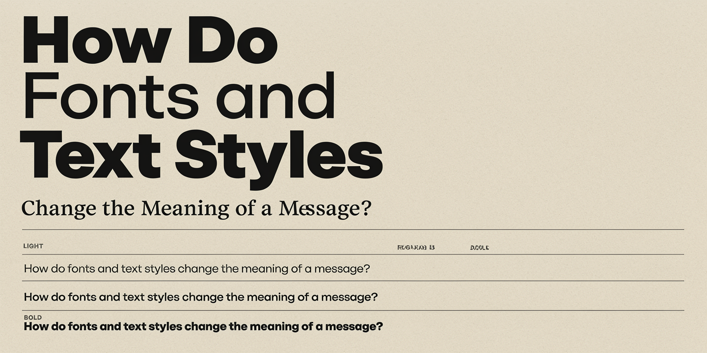
Words communicate ideas, but their appearance can change how people understand them. A simple sentence may sound friendly, serious, urgent, or playful depending on its font, size, color, and style. From social media posts to business websites, typography shapes first impressions and influences how readers respond to information. Understanding how fonts and text styles affect meaning can help you create clearer messages, build trust, and communicate more effectively in both digital and printed content.
What Makes Fonts and Text Styles Important in Communication?
Fonts and text styles influence how people interpret written messages. Although words carry the main information, their visual appearance adds emotional meaning. For example, a formal invitation written in an elegant serif font creates a different impression from the same invitation written in a bold, playful font. The message remains unchanged, but its personality feels different.
Typography also helps readers understand the purpose of content before they read every word. A large, bold heading suggests importance, while smaller text often provides supporting details. Designers use these differences to guide attention and organize information. Today, creators can also explore text effects with AI to experiment with different visual styles and create eye-catching text for digital content.
Good typography does more than make words attractive. It supports clear communication and helps people understand information with less effort. When fonts match the message, readers can focus on the content instead of struggling with its presentation.
Key takeaway: Fonts and text styles add visual meaning to written words and influence how readers understand, feel about, and respond to a message.
How Do Different Font Types Affect the Meaning of Words?
Different font families create different impressions because people associate their shapes with familiar settings, brands, and experiences. A font often used in newspapers may feel more traditional, while a rounded font may seem casual and approachable.
Serif Fonts: Traditional and Professional
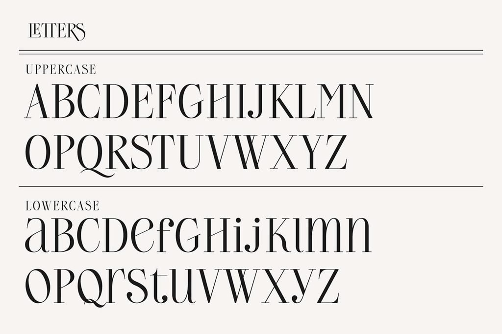
Serif fonts feature small strokes at the ends of letters. Popular examples include Georgia, Garamond, and Times New Roman. These fonts often appear in books, newspapers, academic publications, and formal documents.
Their traditional appearance can suggest credibility, experience, and professionalism. For example, a historical article may feel more authoritative when its headline uses a classic serif font. However, readers also judge credibility through accuracy, sources, and overall design.
Sans-Serif Fonts: Modern and Clear
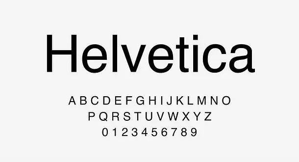
Sans-serif fonts do not have the small decorative strokes found in serif fonts. Arial, Helvetica, and Open Sans are familiar examples. Their simple shapes often create a modern and straightforward appearance.
These fonts are common on websites, mobile applications, and digital dashboards. Their clean design can make short messages easier to scan, especially when designers choose suitable sizes and spacing.
Script and Decorative Fonts: Creative and Expressive
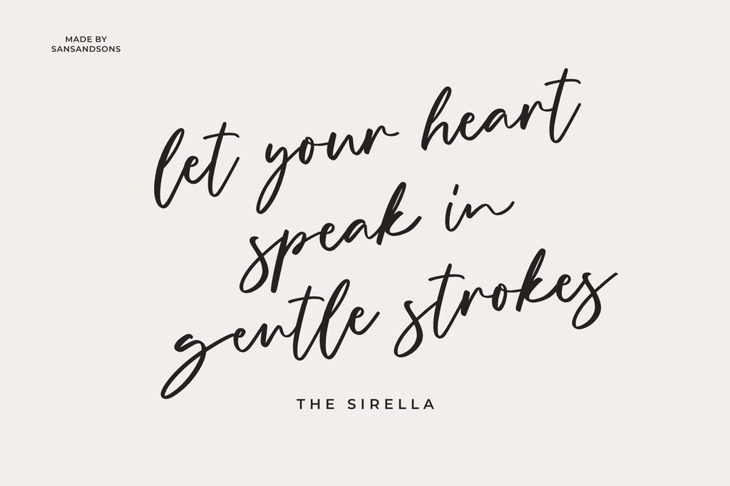
Script fonts imitate handwriting, while decorative fonts use unusual shapes or artistic details. Both styles can communicate creativity, personality, and emotion.
A handwritten font might make a greeting card feel personal. A decorative font could give a music poster a bold identity. However, complex letterforms may become difficult to read in long paragraphs.
The best choice depends on the message, audience, and reading environment.
Key takeaway: Serif fonts often suggest tradition, sans-serif fonts create a modern feel, and decorative fonts add personality. Each style works best when it supports the content.
How Do Font Size, Weight, and Spacing Change a Message?
Font selection is only one part of typography. Size, weight, and spacing also influence how readers interpret information.
Font size refers to how large or small letters appear. Larger text usually attracts attention first. Designers often use it for headlines, warnings, and important announcements. Smaller text works well for supporting information, provided it remains readable.
Font weight describes how thick or thin the characters appear. Bold text can emphasize urgency, confidence, or importance. Lighter weights may create a softer and more subtle impression.
Letter spacing refers to the distance between individual characters. Wider spacing can make a short heading feel spacious or refined. Tight spacing may create a compact appearance, but excessive compression can make words harder to recognize.
Line spacing controls the vertical distance between lines of text. Comfortable spacing helps readers follow paragraphs without losing their place.
Consider these examples:
SALE TODAY!
Bold, large letters create urgency.
Sale today
Smaller, lighter text feels calmer.
Both examples communicate the same event. However, their visual presentation creates different levels of excitement.
Designers should use emphasis carefully. When every sentence appears bold or oversized, readers struggle to identify what matters most.
Key takeaway: Font size, weight, and spacing establish visual hierarchy, which helps readers recognize important information and understand the intended tone.
How Does Text Color Influence Emotions and Interpretation?
Color adds another layer of meaning to typography. People often associate colors with certain emotions, experiences, and cultural ideas. These associations can influence how a written message feels.
For example, red may communicate urgency, excitement, or danger. Blue often appears in professional and technology-related designs, where it can suggest calmness or reliability. Green commonly appears in environmental content, while black can create a serious or elegant appearance.
However, color meanings are not universal. Culture, personal experience, and surrounding design elements affect how people interpret them.
IMPORTANT
Urgent or serious
INFORMATION
Clear and professional
GROW
Nature and progress
WELCOME
Warm and inviting
Color also affects readability. Light gray letters on a white background may look elegant, but some readers will struggle to see them.
The World Wide Web Consortium’s accessibility guidance recommends a minimum contrast ratio of 4.5:1 for normal text and 3:1 for large text under WCAG 2.2 Level AA.
This means designers should consider both emotional impact and practical visibility when choosing text colors.
Key takeaway: Text color can influence emotional tone, but strong contrast and clear visibility are essential for accessible communication.
Why Can the Same Sentence Feel Different in Different Fonts?
People do not interpret words in isolation. They also notice the visual context in which those words appear. Typography can make a statement feel confident, friendly, dramatic, or uncertain.
Consider the sentence, “We need to talk.”
WE NEED TO TALK.
Bold capitals can feel serious or confrontational.
We need to talk.
Italic text may feel softer or more personal.
We need to talk 🙂
A friendly symbol may reduce the perceived tension.
The basic statement remains the same, yet each presentation suggests a different emotional tone.
This effect matters in digital communication because readers cannot always hear the speaker’s voice or observe facial expressions. Visual choices can provide extra clues, although they cannot fully replace human tone and context.
Research on typography supports the idea that visual presentation affects perception. A study published in Psychological Science, The Effect of Typeface on the Perception of Written Information, explored how typefaces influence readers’ responses to written content.
Still, typography does not determine meaning on its own. The words, audience, and situation remain important.
Key takeaway: Identical sentences can produce different emotional reactions when their typography changes, even though the literal meaning stays the same.
How Are AI Text Effects Changing Digital Typography?
Artificial intelligence has introduced new ways to design and customize written content. Instead of manually adjusting every detail, creators can use AI-assisted tools to explore font treatments, textures, shadows, and visual effects.
For example, a designer preparing a science-themed poster might experiment with metallic lettering, glowing outlines, or futuristic styles. An educational creator could use simpler effects to make a heading more engaging without distracting from the lesson.
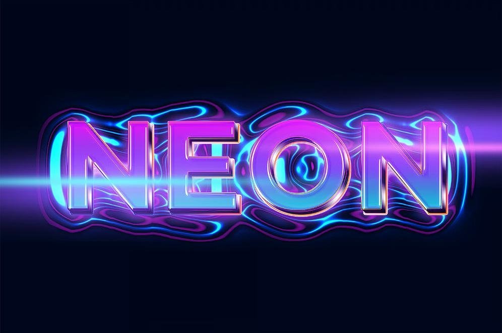
Using text effects with AI can also support the creative process by generating visual ideas quickly. However, AI-generated lettering sometimes contains misspelled words, distorted characters, or inconsistent spacing. Every result needs human review before publication.
Creators should also remember that decorative text embedded in an image may not work well with screen readers or search engines. Important words should remain available as real, selectable text whenever possible.
AI is most useful when it supports a clear design goal. A dramatic visual effect might suit an entertainment poster, but it could distract readers from a detailed educational article.
Key takeaway: AI can expand creative typography options, but readability, accurate lettering, accessibility, and human judgment should guide the final design.
How Do Fonts and Text Styles Affect Website Readability?
Website typography influences how comfortably visitors read and navigate content. Clear fonts help readers identify headings, understand paragraphs, and locate useful information.
A website with inconsistent fonts, crowded lines, or weak contrast can make even helpful information difficult to follow. In contrast, a well-organized page encourages readers to focus on the subject.
For educational and fact-based websites such as Factsparkz, typography should support learning. Articles that explain science, technology, history, or everyday facts benefit from simple layouts and recognizable headings. Readers should be able to find answers without searching through unnecessary visual decoration.
A useful website typography checklist includes:
- Choose one main font for body text and a compatible font for headings.
- Use readable body text, often around 16 to 18 CSS pixels as a starting point.
- Keep line lengths comfortable, typically around 45 to 75 characters for longer paragraphs.
- Maintain consistent heading sizes and spacing.
- Use bold text only when emphasis adds value.
- Check readability on both mobile and desktop screens.
- Avoid placing essential information only inside decorative images.
These practices also support content structure. Search engines can better understand pages when publishers use meaningful HTML headings and readable text rather than relying only on visual formatting.
For more examples of how design and digital tools shape communication, readers can explore related educational and technology content on Factsparkz.
Key takeaway: Readable website typography combines clear fonts, comfortable spacing, consistent headings, and accessible design to make information easier to understand.
How Can You Choose the Right Font for Any Message?
Choosing a font becomes easier when you focus on communication goals instead of appearance alone. A beautiful font is not always the most effective choice.
Start by asking what readers should feel or do after seeing the message. A safety notice needs immediate clarity, while a birthday invitation can use a more expressive style.
Next, consider where the message will appear. A font that looks attractive on a large poster may become difficult to read on a phone. Testing the design at its actual display size can reveal problems before publication.
Follow this simple process:
- Identify the purpose. Decide whether the message should inform, warn, entertain, or persuade.
- Understand the audience. Consider readers’ needs, expectations, and familiarity with the subject.
- Select a suitable font family. Match its personality to the content.
- Build a clear hierarchy. Make headings distinct from body text.
- Check contrast and spacing. Ensure that every important word remains easy to read.
- Test the final design. View it on different screens and ask whether the intended tone comes across.
For example, a scientific explanation may benefit from a simple sans-serif body font and clear headings. A literary magazine may use serif typography to create a more traditional reading experience.
Neither choice is automatically better. The right font is the one that serves the message and the people reading it.
Key takeaway: Choose fonts based on purpose, audience, readability, and context rather than decoration alone.
Frequently Asked Questions
1. Can fonts really change the meaning of a message?
Yes. Fonts can change the emotional tone and perceived personality of written content. Bold lettering may suggest urgency, while rounded or handwritten styles may appear more friendly.
In short: Fonts influence how people interpret a message without changing its actual words.
2. Which font style is best for readability?
Simple, well-designed serif and sans-serif fonts can both support good readability. Font size, spacing, contrast, and screen quality also matter.
In short: The most readable font is one that remains clear and comfortable in its intended setting.
3. Why do designers use bold and italic text?
Designers use bold text to emphasize important information and italics to highlight certain words, titles, or changes in tone. Both styles help establish visual hierarchy.
In short: Bold and italic formatting guide attention and add emphasis when used carefully.
4. Can AI-generated text styles improve visual content?
Yes. AI tools can help creators explore lettering effects, visual themes, and decorative styles. However, designers must check spelling, clarity, and accessibility before using the results.
In short: AI-assisted text styling can improve creativity when human review protects readability and accuracy.
5. Do fonts affect how trustworthy a website appears?
Fonts can contribute to a website’s professional appearance and first impression. However, trustworthy content also requires accurate information, credible sources, and transparent presentation.
In short: Typography can support perceived credibility, but it cannot replace reliable information.
Conclusion: Why Does Typography Matter More Than We Think?
Fonts and text styles do much more than decorate written words. They influence emotions, establish priorities, support readability, and shape the overall experience of communication. A carefully chosen font can make complex information easier to understand, while an unsuitable style can create confusion or send the wrong emotional signal.
As digital design continues to evolve, creators have more opportunities to experiment with typography, including text effects with AI. Yet the main goal remains unchanged: communicate information clearly and effectively.
Whether you are writing an educational article, designing a website, or creating a social media graphic, thoughtful typography helps your message reach the right audience.
Final takeaway: Effective typography combines visual appeal, readability, and clear meaning. For educational publishers, this also supports accessible content, stronger reader engagement, and a better foundation for search visibility.
