
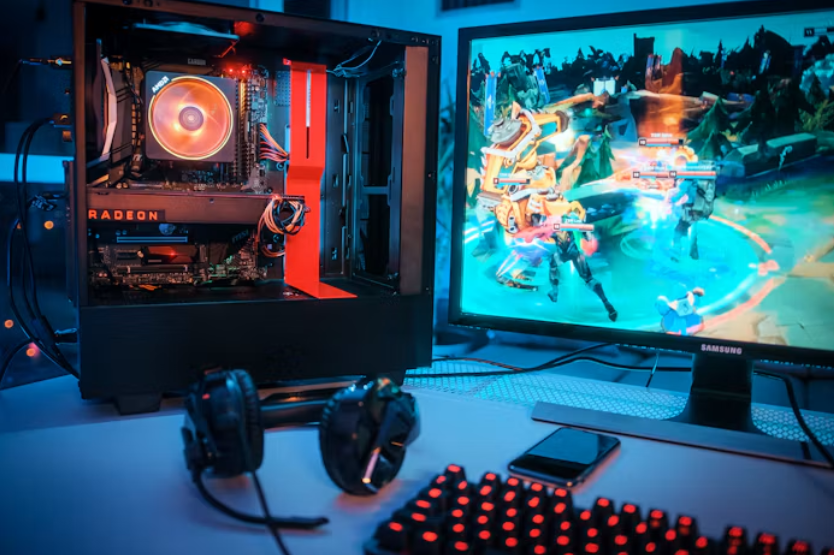
A game might look perfect on a large desktop monitor, with detailed graphics, neatly arranged menus, and plenty of room for controls. Open that same game on a phone, however, and the experience can change dramatically. Buttons become harder to reach, text appears smaller, and important information competes for limited space.
Creating games that work across both devices requires careful planning. Developers must consider screen dimensions, interaction methods, performance, and accessibility while preserving the features that make the game enjoyable. The challenge involves adapting the entire experience rather than simply resizing the graphics.
Building Flexible Layouts for Different Screen Sizes
Desktop monitors provide enough space for developers to display several interface elements simultaneously. A strategy game might show a map, inventory, and character statistics alongside the main action. On a phone, displaying everything in the same arrangement could leave little room for gameplay.
Responsive design helps solve this problem. Developers create layouts that adjust to different screen dimensions and orientations. Instead of shrinking every element proportionally, they can reposition menus, reorganise information, and change how much content appears at once.
Consider a puzzle game with a large playing board and several controls. Its desktop version might place the controls beside the board. On mobile, moving them underneath the puzzle could preserve the board’s visibility while keeping the interface accessible.
Screen proportions also influence these decisions. A widescreen monitor and a vertically held smartphone offer very different viewing areas. Developers must test how layouts behave when players rotate devices or use screens with unusual dimensions. Flexible arrangements help prevent important elements from disappearing or overlapping.
Designing Controls for Mouse, Keyboard, and Touch
Different devices change how players interact with games. A mouse offers precise movement, while keyboards provide shortcuts for frequently used actions. Touchscreens depend on fingers, which cover more space and make small targets difficult to select accurately.
This difference affects button design. A tiny inventory icon might work perfectly with a mouse cursor but become frustrating on a phone. Developers often enlarge important buttons, increase the spacing between them, and position frequently used controls within comfortable reach.
Some games require more substantial changes. A desktop adventure game might use keyboard commands for movement and mouse clicks for selecting objects. Its mobile version could replace these inputs with directional controls, taps, or gestures that feel natural on a touchscreen.
However, gestures need clear explanations. Players shouldn’t have to guess whether an action requires tapping, dragging, or holding a finger against the screen. Consistent controls, immediate visual feedback, and opportunities to correct accidental selections make interaction easier across devices.
Keeping Game Information Clear on Smaller Displays
Games often present more information than players need at any particular moment. Health indicators, scores, maps, instructions, and menus can compete for attention. On desktop screens, developers have greater freedom to display these details without covering the main playing area.
Mobile interfaces require stricter priorities. Essential information should remain visible, while secondary features can move into expandable panels or menus. This becomes particularly important in games where several pieces of information need to share a relatively small screen.
That challenge is especially noticeable in game formats that combine visual action with several controls and pieces of information at once. Casino games fall into that category because their interfaces often need to present the game itself alongside betting controls and other details. When slots online are played on desktop, the interface can make use of a wider layout for the reels, wager controls, and payout information, while the mobile version may need to stack or reposition those elements to keep the screen clear and usable.
Clear information also depends on presentation. Text needs sufficient contrast, icons should have recognisable meanings, and important notifications must remain visible long enough to understand. These principles apply across gaming genres, particularly when several events happen quickly or the interface changes during play.
Balancing Graphics, Animation, and Device Performance
A visually impressive game can become frustrating when its animations stutter or controls respond slowly. Desktop computers and mobile devices vary considerably in processing power, memory, and graphics capabilities. Developers therefore need to balance visual detail with reliable performance.
One approach involves adjusting graphical settings for different hardware. Detailed shadows, reflections, and particle effects can require substantial processing resources. Reducing their complexity on less powerful devices may improve responsiveness without changing the essential gameplay.
Asset optimisation matters too. Large image files and elaborate animations can increase loading times, especially on slower connections. Developers may compress textures, simplify background details, or load certain resources only when needed. These decisions help games start faster and run more smoothly.
Performance problems can also affect usability. If an animation delays a button response, players may tap again and accidentally repeat an action. Developers must therefore examine frame rates and input responsiveness alongside visual quality. A simpler presentation that responds consistently can provide a better experience than impressive graphics interrupted by delays.
Testing Games Across Devices and Real-World Conditions
A game that works on one device isn’t necessarily ready for every screen. Differences in operating systems, browser behaviour, hardware, and display dimensions can produce unexpected problems. Testing helps developers identify these issues before they affect players.
Teams typically examine how interfaces behave across a range of devices. They check whether menus remain accessible, text stays readable, and controls respond correctly. Testing portrait and landscape orientations can reveal problems that aren’t obvious when using only one screen arrangement.
Real-world conditions introduce further complications. Players may switch between Wi-Fi and mobile networks, receive notifications, or temporarily lose connectivity. Developers need to consider how games respond to interruptions, particularly when progress must be saved or an online session reconnects.
Accessibility deserves equal attention. Adjustable text, sufficient colour contrast, and alternatives to sound-based instructions can make games easier to use. Testing these features with different input methods helps developers identify barriers that technical performance checks alone might miss.
Creating a Consistent Experience Across Screens
Designing for desktop and mobile requires more than making a game fit two screen sizes. Developers must rethink layouts, adapt controls, organise information, and optimise performance for different hardware. Testing then reveals whether those decisions work under everyday conditions.
The goal is to preserve a familiar experience while respecting each device’s strengths and limitations. When important information remains clear, controls respond naturally, and the game runs smoothly, players can concentrate on the gameplay instead of struggling with the interface.
